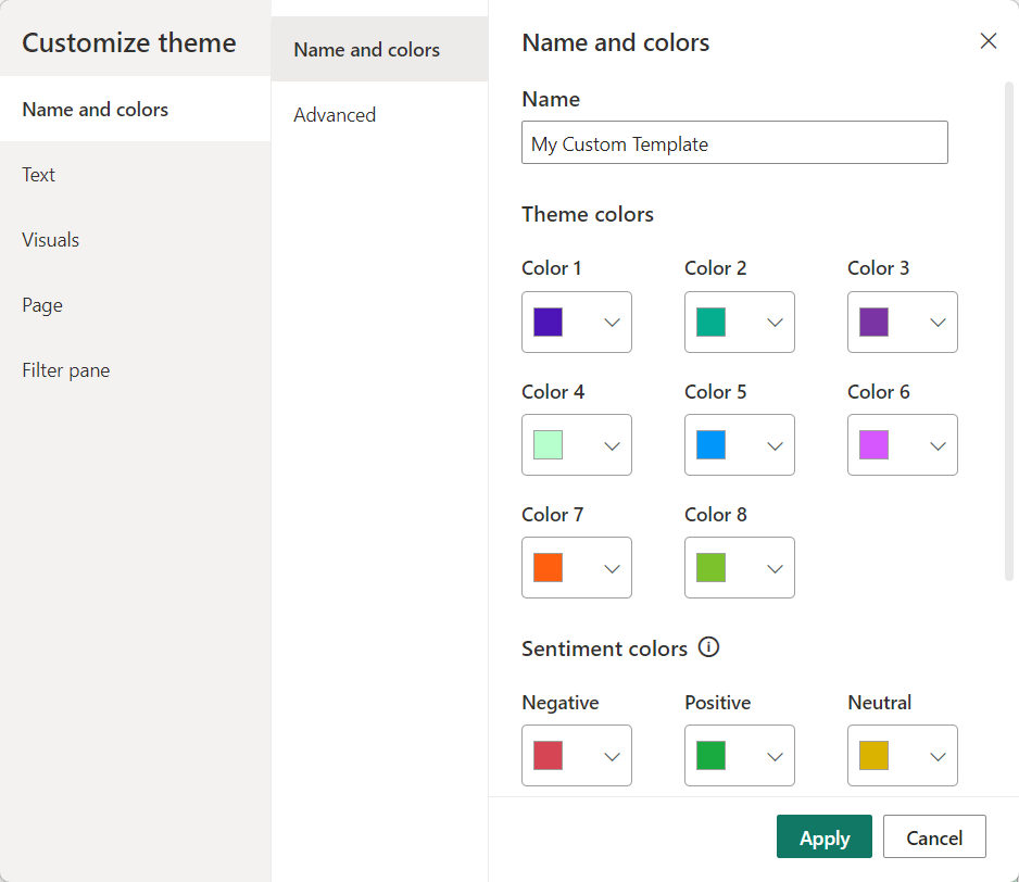
Power BI reports have a theme that specifies the default colors, fonts, and visual styles. In Power BI Desktop, you can choose to use a built-in theme, start with a built-in theme and customize it, or create your own theme.
Creating your own theme involves specifying formatting options in a JSON file and importing it into your report. This post will focus on the theme colors, but there are lots of other options that can be specified in a theme, including structural colors, fonts, and page and visual formatting options.
In a report theme, there are 3 primary sets of colors to specify:
- data colors
- sentiment colors
- divergent colors
Data Colors
Theme colors are applied to the visuals and other objects you add to your report page. For example, if you add a clustered bar chart, the data colors will be used as the bar fill color. While you can specify as many data colors as you like in a theme JSON file, you will only see 8 in the Power BI Desktop user interface.
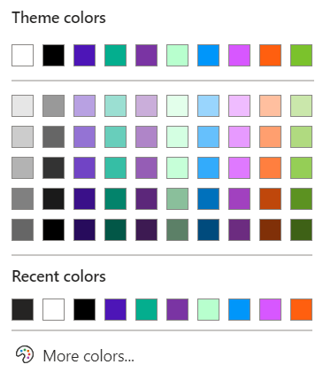
Power BI automatically adds black and white to your theme colors. When you use the color palette in Power BI, it will offer you several tints and shades of the colors you specify, plus black and white. You have the specified colors on the top row, then 60% lighter, 40% lighter, 20% lighter, 25% darker, and 50% darker. The percentages are hard coded.
Data Color Application
The colors have an ordinal position or index. Using the example above, the bright blue is color 0, green is 1, purple is 2, and so on. When you use colors from your theme in a visual, they are referenced by position. So if you change the third theme color from purple to maroon, all contents that were colored with the theme purple will change to maroon. If you instead selected a custom color on a visual by entering a hex value for a color not in the theme, that color would remain unchanged when you update your theme colors.
When you have a visual with a known number and order of series, Power BI will apply the data colors by index (ordinal position). When the number of series is dynamic, the individual members of the series are assigned a theme color as they are read in. Power BI will assign the same color for the same value in another visual if those values are reused. Because data may load differently on each report refresh, the colors may change.
Not all custom visuals respect your theme colors, this is especially true for some of the older ones. You’ll want to test that the custom visuals you are using work with your theme.
Theme Colors in Dashboards
If you use dashboards in the Power BI service, you can import your theme to a dashboard to apply the same data colors there. While there are additional properties you may want to specify for a dashboard theme, the dataColors array is the same for reports and dashboards.
Sentiment and Divergent Colors
The sentiment colors are assigned as status colors to the waterfall chart and KPI visual by default.
The divergent colors are assigned when you choose to use gradient colors in conditional formatting.
Referencing Theme Colors in DAX
I’m not aware of a way to reference the data colors directly with DAX. You can reference the divergent theme colors with DAX by using “minColor”, “midColor”, and “maxColor”. And you can reference the sentiment colors using “good”, “bad”, and “neutral”.
Referencing Theme Colors in Deneb
If you use the Deneb custom visual, it has a custom function pbiColor that allows you to reference theme colors. It has two parameters: index or name, and shadePercent. You can refer to a data color by (zero-based) index, or a sentiment or divergent color by name. For example, assigning "pbiColor(0)" to the color expression on a mark would reference the first data color in your theme.
Did I miss something you think is important to understand about Power BI theme colors? Please share in the comments.


